- java.lang.Object
-
- org.eclipse.swt.widgets.Widget
-
- org.eclipse.swt.widgets.Item
-
- org.eclipse.swt.widgets.ToolItem
-
public class ToolItem
extends Item
Instances of this class represent a selectable user interface object that represents a button in a tool bar.- Styles:
- PUSH, CHECK, RADIO, SEPARATOR, DROP_DOWN
- Events:
- Selection
Note: Only one of the styles CHECK, PUSH, RADIO, SEPARATOR and DROP_DOWN may be specified.
IMPORTANT: This class is not intended to be subclassed.
-
-
Field Summary
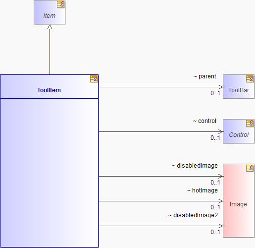
Fields Modifier and Type Field and Description (package private) Controlcontrol(package private) shortcx(package private) ImagedisabledImage(package private) ImagedisabledImage2(package private) ImagehotImage(package private) intid(package private) ToolBarparent(package private) java.lang.StringtoolTipText-
Fields inherited from class org.eclipse.swt.widgets.Widget
CANVAS, data, DEFAULT_HEIGHT, DEFAULT_WIDTH, DISABLED, display, DISPOSE_SENT, DISPOSED, DRAG_DETECT, DRAW_BACKGROUND, eventTable, FOREIGN_HANDLE, HIDDEN, IGNORE_WM_CHANGEUISTATE, KEYED_DATA, LAYOUT_CHANGED, LAYOUT_CHILD, LAYOUT_NEEDED, MAJOR, MINOR, MOVE_DEFERRED, MOVE_OCCURRED, PARENT_BACKGROUND, RELEASED, RESIZE_DEFERRED, RESIZE_OCCURRED, SKIN_NEEDED, state, style, THEME_BACKGROUND, TRACK_MOUSE
-
-
Constructor Summary
Constructors Constructor and Description ToolItem(ToolBar parent, int style)Constructs a new instance of this class given its parent (which must be aToolBar) and a style value describing its behavior and appearance.ToolItem(ToolBar parent, int style, int index)Constructs a new instance of this class given its parent (which must be aToolBar), a style value describing its behavior and appearance, and the index at which to place it in the items maintained by its parent.
-
Method Summary
Methods Modifier and Type Method and Description voidaddSelectionListener(SelectionListener listener)Adds the listener to the collection of listeners who will be notified when the control is selected by the user, by sending it one of the messages defined in theSelectionListenerinterface.(package private) static intcheckStyle(int style)protected voidcheckSubclass()Checks that this class can be subclassed.(package private) voidclick(boolean dropDown)(package private) Widget[]computeTabList()(package private) voiddestroyWidget()Destroys the widget in the operating system and releases the widget's handle.RectanglegetBounds()Returns a rectangle describing the receiver's size and location relative to its parent.ControlgetControl()Returns the control that is used to fill the bounds of the item when the item is aSEPARATOR.ImagegetDisabledImage()Returns the receiver's disabled image if it has one, or null if it does not.booleangetEnabled()Returnstrueif the receiver is enabled, andfalseotherwise.ImagegetHotImage()Returns the receiver's hot image if it has one, or null if it does not.ToolBargetParent()Returns the receiver's parent, which must be aToolBar.booleangetSelection()Returnstrueif the receiver is selected, and false otherwise.java.lang.StringgetToolTipText()Returns the receiver's tool tip text, or null if it has not been set.intgetWidth()Gets the width of the receiver.booleanisEnabled()Returnstrueif the receiver is enabled and all of the receiver's ancestors are enabled, andfalseotherwise.(package private) booleanisTabGroup()(package private) voidreleaseHandle()(package private) voidreleaseImages()(package private) voidreleaseWidget()voidremoveSelectionListener(SelectionListener listener)Removes the listener from the collection of listeners who will be notified when the control is selected by the user.(package private) voidresizeControl()(package private) voidselectRadio()voidsetControl(Control control)Sets the control that is used to fill the bounds of the item when the item is aSEPARATOR.voidsetDisabledImage(Image image)Sets the receiver's disabled image to the argument, which may be null indicating that no disabled image should be displayed.voidsetEnabled(boolean enabled)Enables the receiver if the argument istrue, and disables it otherwise.voidsetHotImage(Image image)Sets the receiver's hot image to the argument, which may be null indicating that no hot image should be displayed.voidsetImage(Image image)Sets the receiver's image to the argument, which may be null indicating that no image should be displayed.(package private) booleansetRadioSelection(boolean value)voidsetSelection(boolean selected)Sets the selection state of the receiver.(package private) booleansetTabItemFocus()voidsetText(java.lang.String string)Sets the receiver's text.voidsetToolTipText(java.lang.String string)Sets the receiver's tool tip text to the argument, which may be null indicating that the default tool tip for the control will be shown.voidsetWidth(int width)Sets the width of the receiver, forSEPARATORToolItems.(package private) voidupdateImages(boolean enabled)(package private) intwidgetStyle()(package private) LRESULTwmCommandChild(int wParam, int lParam)-
Methods inherited from class org.eclipse.swt.widgets.Item
getImage, getNameText, getText
-
Methods inherited from class org.eclipse.swt.widgets.Widget
_addListener, addDisposeListener, addListener, callWindowProc, checkBits, checkOpened, checkOrientation, checkParent, checkWidget, DeferWindowPos, dispose, dragDetect, error, filters, findItem, fixMnemonic, fixMnemonic, getData, getData, getDisplay, getListeners, getMenu, getName, getStyle, hooks, isDisposed, isListening, isValidSubclass, isValidThread, mapEvent, new_GC, notifyListeners, postEvent, postEvent, release, releaseChildren, releaseParent, removeDisposeListener, removeListener, removeListener, reskin, reskinChildren, reskinWidget, sendDragEvent, sendDragEvent, sendEvent, sendEvent, sendEvent, sendEvent, sendFocusEvent, sendKeyEvent, sendKeyEvent, sendMouseEvent, sendMouseEvent, sendMouseWheelEvent, sendSelectionEvent, sendSelectionEvent, setData, setData, setInputState, setKeyState, setLocationMask, setTabGroupFocus, SetWindowPos, showMenu, showMenu, toString, updateMenuLocation, wmCaptureChanged, wmChar, wmContextMenu, wmIMEChar, wmKeyDown, wmKeyUp, wmKillFocus, wmLButtonDblClk, wmLButtonDown, wmLButtonUp, wmMButtonDblClk, wmMButtonDown, wmMButtonUp, wmMouseHover, wmMouseHWheel, wmMouseLeave, wmMouseMove, wmMouseWheel, wmNCPaint, wmPaint, wmPrint, wmRButtonDblClk, wmRButtonDown, wmRButtonUp, wmSetFocus, wmSysChar, wmSysKeyDown, wmSysKeyUp, wmXButtonDblClk, wmXButtonDown, wmXButtonUp
-
-
-
-
Field Detail
-
parent
ToolBar parent
-
control
Control control
-
toolTipText
java.lang.String toolTipText
-
disabledImage
Image disabledImage
-
hotImage
Image hotImage
-
disabledImage2
Image disabledImage2
-
id
int id
-
cx
short cx
-
-
Constructor Detail
-
ToolItem
public ToolItem(ToolBar parent,
        int style)
Constructs a new instance of this class given its parent (which must be aToolBar) and a style value describing its behavior and appearance. The item is added to the end of the items maintained by its parent.The style value is either one of the style constants defined in class
SWTwhich is applicable to instances of this class, or must be built by bitwise OR'ing together (that is, using theint"|" operator) two or more of thoseSWTstyle constants. The class description lists the style constants that are applicable to the class. Style bits are also inherited from superclasses.- Parameters:
parent- a composite control which will be the parent of the new instance (cannot be null)style- the style of control to construct- Throws:
java.lang.IllegalArgumentException-- ERROR_NULL_ARGUMENT - if the parent is null
SWTException-- ERROR_THREAD_INVALID_ACCESS - if not called from the thread that created the parent
- ERROR_INVALID_SUBCLASS - if this class is not an allowed subclass
- See Also:
SWT.PUSH,SWT.CHECK,SWT.RADIO,SWT.SEPARATOR,SWT.DROP_DOWN,Widget.checkSubclass(),Widget.getStyle()
-
ToolItem
public ToolItem(ToolBar parent,
        int style,
        int index)
Constructs a new instance of this class given its parent (which must be aToolBar), a style value describing its behavior and appearance, and the index at which to place it in the items maintained by its parent.The style value is either one of the style constants defined in class
SWTwhich is applicable to instances of this class, or must be built by bitwise OR'ing together (that is, using theint"|" operator) two or more of thoseSWTstyle constants. The class description lists the style constants that are applicable to the class. Style bits are also inherited from superclasses.- Parameters:
parent- a composite control which will be the parent of the new instance (cannot be null)style- the style of control to constructindex- the zero-relative index to store the receiver in its parent- Throws:
java.lang.IllegalArgumentException-- ERROR_NULL_ARGUMENT - if the parent is null
- ERROR_INVALID_RANGE - if the index is not between 0 and the number of elements in the parent (inclusive)
SWTException-- ERROR_THREAD_INVALID_ACCESS - if not called from the thread that created the parent
- ERROR_INVALID_SUBCLASS - if this class is not an allowed subclass
- See Also:
SWT.PUSH,SWT.CHECK,SWT.RADIO,SWT.SEPARATOR,SWT.DROP_DOWN,Widget.checkSubclass(),Widget.getStyle()
-
-
Method Detail
-
addSelectionListener
public void addSelectionListener(SelectionListener listener)
Adds the listener to the collection of listeners who will be notified when the control is selected by the user, by sending it one of the messages defined in theSelectionListenerinterface.When
widgetSelectedis called when the mouse is over the arrow portion of a drop-down tool, the event object detail field contains the valueSWT.ARROW.widgetDefaultSelectedis not called.When the
SWT.RADIOstyle bit is set, thewidgetSelectedmethod is also called when the receiver loses selection because another item in the same radio group was selected by the user. DuringwidgetSelectedthe application can usegetSelection()to determine the current selected state of the receiver.- Parameters:
listener- the listener which should be notified when the control is selected by the user,- Throws:
java.lang.IllegalArgumentException-- ERROR_NULL_ARGUMENT - if the listener is null
SWTException-- ERROR_WIDGET_DISPOSED - if the receiver has been disposed
- ERROR_THREAD_INVALID_ACCESS - if not called from the thread that created the receiver
- See Also:
SelectionListener,removeSelectionListener(org.eclipse.swt.events.SelectionListener),SelectionEvent
-
checkStyle
static int checkStyle(int style)
-
checkSubclass
protected void checkSubclass()
Description copied from class:WidgetChecks that this class can be subclassed.The SWT class library is intended to be subclassed only at specific, controlled points (most notably,
CompositeandCanvaswhen implementing new widgets). This method enforces this rule unless it is overridden.IMPORTANT: By providing an implementation of this method that allows a subclass of a class which does not normally allow subclassing to be created, the implementer agrees to be fully responsible for the fact that any such subclass will likely fail between SWT releases and will be strongly platform specific. No support is provided for user-written classes which are implemented in this fashion.
The ability to subclass outside of the allowed SWT classes is intended purely to enable those not on the SWT development team to implement patches in order to get around specific limitations in advance of when those limitations can be addressed by the team. Subclassing should not be attempted without an intimate and detailed understanding of the hierarchy.
- Overrides:
checkSubclassin classItem
-
click
void click(boolean dropDown)
-
computeTabList
Widget[] computeTabList()
-
destroyWidget
void destroyWidget()
Description copied from class:WidgetDestroys the widget in the operating system and releases the widget's handle. If the widget does not have a handle, this method may hide the widget, mark the widget as destroyed or do nothing, depending on the widget.When a widget is destroyed in the operating system, its descendants are also destroyed by the operating system. This means that it is only necessary to call
destroyWidgeton the root of the widget tree.This method is called after
releaseWidget().See also
releaseChild(),releaseWidget()andreleaseHandle().- Overrides:
destroyWidgetin classWidget- See Also:
Widget.dispose()
-
getBounds
public Rectangle getBounds()
Returns a rectangle describing the receiver's size and location relative to its parent.- Returns:
- the receiver's bounding rectangle
- Throws:
SWTException-- ERROR_WIDGET_DISPOSED - if the receiver has been disposed
- ERROR_THREAD_INVALID_ACCESS - if not called from the thread that created the receiver
-
getControl
public Control getControl()
Returns the control that is used to fill the bounds of the item when the item is aSEPARATOR.- Returns:
- the control
- Throws:
SWTException-- ERROR_WIDGET_DISPOSED - if the receiver has been disposed
- ERROR_THREAD_INVALID_ACCESS - if not called from the thread that created the receiver
-
getDisabledImage
public Image getDisabledImage()
Returns the receiver's disabled image if it has one, or null if it does not.The disabled image is displayed when the receiver is disabled.
- Returns:
- the receiver's disabled image
- Throws:
SWTException-- ERROR_WIDGET_DISPOSED - if the receiver has been disposed
- ERROR_THREAD_INVALID_ACCESS - if not called from the thread that created the receiver
-
getEnabled
public boolean getEnabled()
Returnstrueif the receiver is enabled, andfalseotherwise. A disabled control is typically not selectable from the user interface and draws with an inactive or "grayed" look.- Returns:
- the receiver's enabled state
- Throws:
SWTException-- ERROR_WIDGET_DISPOSED - if the receiver has been disposed
- ERROR_THREAD_INVALID_ACCESS - if not called from the thread that created the receiver
- See Also:
isEnabled()
-
getHotImage
public Image getHotImage()
Returns the receiver's hot image if it has one, or null if it does not.The hot image is displayed when the mouse enters the receiver.
- Returns:
- the receiver's hot image
- Throws:
SWTException-- ERROR_WIDGET_DISPOSED - if the receiver has been disposed
- ERROR_THREAD_INVALID_ACCESS - if not called from the thread that created the receiver
-
getParent
public ToolBar getParent()
Returns the receiver's parent, which must be aToolBar.- Returns:
- the receiver's parent
- Throws:
SWTException-- ERROR_WIDGET_DISPOSED - if the receiver has been disposed
- ERROR_THREAD_INVALID_ACCESS - if not called from the thread that created the receiver
-
getSelection
public boolean getSelection()
Returnstrueif the receiver is selected, and false otherwise.When the receiver is of type
CHECKorRADIO, it is selected when it is checked (which some platforms draw as a pushed in button). If the receiver is of any other type, this method returns false.- Returns:
- the selection state
- Throws:
SWTException-- ERROR_WIDGET_DISPOSED - if the receiver has been disposed
- ERROR_THREAD_INVALID_ACCESS - if not called from the thread that created the receiver
-
getToolTipText
public java.lang.String getToolTipText()
Returns the receiver's tool tip text, or null if it has not been set.- Returns:
- the receiver's tool tip text
- Throws:
SWTException-- ERROR_WIDGET_DISPOSED - if the receiver has been disposed
- ERROR_THREAD_INVALID_ACCESS - if not called from the thread that created the receiver
-
getWidth
public int getWidth()
Gets the width of the receiver.- Returns:
- the width
- Throws:
SWTException-- ERROR_WIDGET_DISPOSED - if the receiver has been disposed
- ERROR_THREAD_INVALID_ACCESS - if not called from the thread that created the receiver
-
isEnabled
public boolean isEnabled()
Returnstrueif the receiver is enabled and all of the receiver's ancestors are enabled, andfalseotherwise. A disabled control is typically not selectable from the user interface and draws with an inactive or "grayed" look.- Returns:
- the receiver's enabled state
- Throws:
SWTException-- ERROR_WIDGET_DISPOSED - if the receiver has been disposed
- ERROR_THREAD_INVALID_ACCESS - if not called from the thread that created the receiver
- See Also:
getEnabled()
-
isTabGroup
boolean isTabGroup()
-
releaseWidget
void releaseWidget()
- Overrides:
releaseWidgetin classItem
-
releaseHandle
void releaseHandle()
- Overrides:
releaseHandlein classWidget
-
releaseImages
void releaseImages()
-
removeSelectionListener
public void removeSelectionListener(SelectionListener listener)
Removes the listener from the collection of listeners who will be notified when the control is selected by the user.- Parameters:
listener- the listener which should no longer be notified- Throws:
java.lang.IllegalArgumentException-- ERROR_NULL_ARGUMENT - if the listener is null
SWTException-- ERROR_WIDGET_DISPOSED - if the receiver has been disposed
- ERROR_THREAD_INVALID_ACCESS - if not called from the thread that created the receiver
- See Also:
SelectionListener,addSelectionListener(org.eclipse.swt.events.SelectionListener)
-
resizeControl
void resizeControl()
-
selectRadio
void selectRadio()
-
setControl
public void setControl(Control control)
Sets the control that is used to fill the bounds of the item when the item is aSEPARATOR.- Parameters:
control- the new control- Throws:
java.lang.IllegalArgumentException-- ERROR_INVALID_ARGUMENT - if the control has been disposed
- ERROR_INVALID_PARENT - if the control is not in the same widget tree
SWTException-- ERROR_WIDGET_DISPOSED - if the receiver has been disposed
- ERROR_THREAD_INVALID_ACCESS - if not called from the thread that created the receiver
-
setEnabled
public void setEnabled(boolean enabled)
Enables the receiver if the argument istrue, and disables it otherwise.A disabled control is typically not selectable from the user interface and draws with an inactive or "grayed" look.
- Parameters:
enabled- the new enabled state- Throws:
SWTException-- ERROR_WIDGET_DISPOSED - if the receiver has been disposed
- ERROR_THREAD_INVALID_ACCESS - if not called from the thread that created the receiver
-
setDisabledImage
public void setDisabledImage(Image image)
Sets the receiver's disabled image to the argument, which may be null indicating that no disabled image should be displayed.The disabled image is displayed when the receiver is disabled.
- Parameters:
image- the disabled image to display on the receiver (may be null)- Throws:
java.lang.IllegalArgumentException-- ERROR_INVALID_ARGUMENT - if the image has been disposed
SWTException-- ERROR_WIDGET_DISPOSED - if the receiver has been disposed
- ERROR_THREAD_INVALID_ACCESS - if not called from the thread that created the receiver
-
setHotImage
public void setHotImage(Image image)
Sets the receiver's hot image to the argument, which may be null indicating that no hot image should be displayed.The hot image is displayed when the mouse enters the receiver.
- Parameters:
image- the hot image to display on the receiver (may be null)- Throws:
java.lang.IllegalArgumentException-- ERROR_INVALID_ARGUMENT - if the image has been disposed
SWTException-- ERROR_WIDGET_DISPOSED - if the receiver has been disposed
- ERROR_THREAD_INVALID_ACCESS - if not called from the thread that created the receiver
-
setImage
public void setImage(Image image)
Description copied from class:ItemSets the receiver's image to the argument, which may be null indicating that no image should be displayed.
-
setRadioSelection
boolean setRadioSelection(boolean value)
-
setSelection
public void setSelection(boolean selected)
Sets the selection state of the receiver.When the receiver is of type
CHECKorRADIO, it is selected when it is checked (which some platforms draw as a pushed in button).- Parameters:
selected- the new selection state- Throws:
SWTException-- ERROR_WIDGET_DISPOSED - if the receiver has been disposed
- ERROR_THREAD_INVALID_ACCESS - if not called from the thread that created the receiver
-
setTabItemFocus
boolean setTabItemFocus()
- Overrides:
setTabItemFocusin classWidget
-
setText
public void setText(java.lang.String string)
Sets the receiver's text. The string may include the mnemonic character.Mnemonics are indicated by an '&' that causes the next character to be the mnemonic. When the user presses a key sequence that matches the mnemonic, a selection event occurs. On most platforms, the mnemonic appears underlined but may be emphasised in a platform specific manner. The mnemonic indicator character '&' can be escaped by doubling it in the string, causing a single '&' to be displayed.
- Overrides:
setTextin classItem- Parameters:
string- the new text- Throws:
java.lang.IllegalArgumentException-- ERROR_NULL_ARGUMENT - if the text is null
SWTException-- ERROR_WIDGET_DISPOSED - if the receiver has been disposed
- ERROR_THREAD_INVALID_ACCESS - if not called from the thread that created the receiver
-
setToolTipText
public void setToolTipText(java.lang.String string)
Sets the receiver's tool tip text to the argument, which may be null indicating that the default tool tip for the control will be shown. For a control that has a default tool tip, such as the Tree control on Windows, setting the tool tip text to an empty string replaces the default, causing no tool tip text to be shown.The mnemonic indicator (character '&') is not displayed in a tool tip. To display a single '&' in the tool tip, the character '&' can be escaped by doubling it in the string.
- Parameters:
string- the new tool tip text (or null)- Throws:
SWTException-- ERROR_WIDGET_DISPOSED - if the receiver has been disposed
- ERROR_THREAD_INVALID_ACCESS - if not called from the thread that created the receiver
-
setWidth
public void setWidth(int width)
Sets the width of the receiver, forSEPARATORToolItems.- Parameters:
width- the new width. If the new value isSWT.DEFAULT, the width is a fixed-width area whose amount is determined by the platform. If the new value is 0 a vertical or horizontal line will be drawn, depending on the setting of the corresponding style bit (SWT.VERTICALorSWT.HORIZONTAL). If the new value isSWT.SEPARATOR_FILLa variable-width space is inserted that acts as a spring between the two adjoining items which will push them out to the extent of the containing ToolBar.- Throws:
SWTException-- ERROR_WIDGET_DISPOSED - if the receiver has been disposed
- ERROR_THREAD_INVALID_ACCESS - if not called from the thread that created the receiver
-
updateImages
void updateImages(boolean enabled)
-
widgetStyle
int widgetStyle()
-
wmCommandChild
LRESULT wmCommandChild(int wParam,
                     int lParam)
-
-