- java.lang.Object
-
- All Implemented Interfaces:
- Drawable
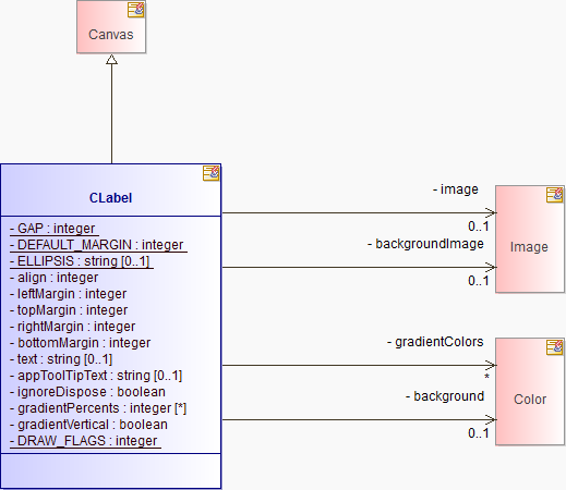
public class CLabel
extends Canvas
A Label which supports aligned text and/or an image and different border styles.If there is not enough space a CLabel uses the following strategy to fit the information into the available space:
ignores the indent in left align mode ignores the image and the gap shortens the text by replacing the center portion of the label with an ellipsis shortens the text by removing the center portion of the label- Styles:
- LEFT, RIGHT, CENTER, SHADOW_IN, SHADOW_OUT, SHADOW_NONE
- Events:
IMPORTANT: This class is not intended to be subclassed.
-
-
Field Summary
Fields Modifier and Type Field and Description private intalignthe alignment.private java.lang.StringappToolTipTextprivate Colorbackgroundprivate ImagebackgroundImageprivate intbottomMarginprivate static intDEFAULT_MARGINLeft and right marginsprivate static intDRAW_FLAGSprivate static java.lang.StringELLIPSISa string inserted in the middle of text that has been shortenedprivate static intGAPGap between icon and textprivate Color[]gradientColorsprivate int[]gradientPercentsprivate booleangradientVerticalprivate booleanignoreDisposeprivate Imageimagethe current iconprivate intleftMarginprivate intrightMarginprivate java.lang.Stringtextthe current textprivate inttopMargin
-
Constructor Summary
Constructors Constructor and Description CLabel(Composite parent, int style)Constructs a new instance of this class given its parent and a style value describing its behavior and appearance.
-
Method Summary
Methods Modifier and Type Method and Description (package private) char_findMnemonic(java.lang.String string)private static intcheckStyle(int style)Check the style bits to ensure that no invalid styles are applied.PointcomputeSize(int wHint, int hHint, boolean changed)Returns the preferred size of the receiver.private voiddrawBevelRect(GC gc, int x, int y, int w, int h, Color topleft, Color bottomright)Draw a rectangle in the given colors.intgetAlignment()Returns the horizontal alignment.intgetBottomMargin()Return the CLabel's bottom margin.ImagegetImage()Return the CLabel's image ornull.intgetLeftMargin()Return the CLabel's left margin.intgetRightMargin()Return the CLabel's right margin.intgetStyle()Returns the receiver's style information.java.lang.StringgetText()Return the Label's text.java.lang.StringgetToolTipText()Returns the receiver's tool tip text, or null if it has not been set.intgetTopMargin()Return the CLabel's top margin.private PointgetTotalSize(Image image, java.lang.String text)Compute the minimum size.private voidinitAccessible()(package private) voidonDispose(Event event)(package private) voidonMnemonic(TraverseEvent event)(package private) voidonPaint(PaintEvent event)private voidpaintBorder(GC gc, Rectangle r)Paint the Label's border.voidsetAlignment(int align)Set the horizontal alignment of the CLabel.voidsetBackground(Color color)Sets the receiver's background color to the color specified by the argument, or to the default system color for the control if the argument is null.voidsetBackground(Color[] colors, int[] percents)Specify a gradient of colours to be drawn in the background of the CLabel.voidsetBackground(Color[] colors, int[] percents, boolean vertical)Specify a gradient of colours to be drawn in the background of the CLabel.voidsetBackground(Image image)Set the image to be drawn in the background of the label.voidsetBottomMargin(int bottomMargin)Set the label's bottom margin, in pixels.voidsetFont(Font font)Sets the font that the receiver will use to paint textual information to the font specified by the argument, or to the default font for that kind of control if the argument is null.voidsetImage(Image image)Set the label's Image.voidsetLeftMargin(int leftMargin)Set the label's horizontal left margin, in pixels.voidsetMargins(int leftMargin, int topMargin, int rightMargin, int bottomMargin)Set the label's margins, in pixels.voidsetRightMargin(int rightMargin)Set the label's right margin, in pixels.voidsetText(java.lang.String text)Set the label's text.voidsetToolTipText(java.lang.String string)Sets the receiver's tool tip text to the argument, which may be null indicating that the default tool tip for the control will be shown.voidsetTopMargin(int topMargin)Set the label's top margin, in pixels.protected java.lang.StringshortenText(GC gc, java.lang.String t, int width)Shorten the given texttso that its length doesn't exceed the given width.private java.lang.String[]splitString(java.lang.String text)(package private) intvalidateOffset(TextLayout layout, int offset)-
Methods inherited from class org.eclipse.swt.widgets.Canvas
drawBackground, getCaret, getIME, scroll, setCaret, setIME
-
Methods inherited from class org.eclipse.swt.widgets.Composite
changed, checkSubclass, drawBackground, getBackgroundMode, getChildren, getLayout, getLayoutDeferred, getTabList, isLayoutDeferred, layout, layout, layout, layout, layout, setBackgroundMode, setFocus, setLayout, setLayoutDeferred, setTabList
-
Methods inherited from class org.eclipse.swt.widgets.Scrollable
computeTrim, getClientArea, getHorizontalBar, getScrollbarsMode, getVerticalBar
-
Methods inherited from class org.eclipse.swt.widgets.Control
addControlListener, addDragDetectListener, addFocusListener, addGestureListener, addHelpListener, addKeyListener, addMenuDetectListener, addMouseListener, addMouseMoveListener, addMouseTrackListener, addMouseWheelListener, addPaintListener, addTouchListener, addTraverseListener, computeSize, dragDetect, dragDetect, forceFocus, getAccessible, getBackground, getBackgroundImage, getBorderWidth, getBounds, getCursor, getDragDetect, getEnabled, getFont, getForeground, getLayoutData, getLocation, getMenu, getMonitor, getOrientation, getParent, getRegion, getShell, getSize, getTouchEnabled, getVisible, internal_dispose_GC, internal_new_GC, isEnabled, isFocusControl, isReparentable, isVisible, moveAbove, moveBelow, pack, pack, print, redraw, redraw, removeControlListener, removeDragDetectListener, removeFocusListener, removeGestureListener, removeHelpListener, removeKeyListener, removeMenuDetectListener, removeMouseListener, removeMouseMoveListener, removeMouseTrackListener, removeMouseWheelListener, removePaintListener, removeTouchListener, removeTraverseListener, setBackgroundImage, setBounds, setBounds, setCapture, setCursor, setDragDetect, setEnabled, setForeground, setLayoutData, setLocation, setLocation, setMenu, setOrientation, setParent, setRedraw, setRegion, setSize, setSize, setTouchEnabled, setVisible, toControl, toControl, toDisplay, toDisplay, traverse, traverse, traverse, update
-
Methods inherited from class org.eclipse.swt.widgets.Widget
addDisposeListener, addListener, checkWidget, dispose, getData, getData, getDisplay, getListeners, isDisposed, isListening, notifyListeners, removeDisposeListener, removeListener, removeListener, reskin, setData, setData, toString
-
-
-
-
Field Detail
-
GAP
private static final int GAP
Gap between icon and text- See Also:
- Constant Field Values
-
DEFAULT_MARGIN
private static final int DEFAULT_MARGIN
Left and right margins- See Also:
- Constant Field Values
-
ELLIPSIS
private static final java.lang.String ELLIPSIS
a string inserted in the middle of text that has been shortened- See Also:
- Constant Field Values
-
align
private int align
the alignment. Either CENTER, RIGHT, LEFT. Default is LEFT
-
leftMargin
private int leftMargin
-
topMargin
private int topMargin
-
rightMargin
private int rightMargin
-
bottomMargin
private int bottomMargin
-
text
private java.lang.String text
the current text
-
image
private Image image
the current icon
-
appToolTipText
private java.lang.String appToolTipText
-
ignoreDispose
private boolean ignoreDispose
-
backgroundImage
private Image backgroundImage
-
gradientColors
private Color[] gradientColors
-
gradientPercents
private int[] gradientPercents
-
gradientVertical
private boolean gradientVertical
-
background
private Color background
-
DRAW_FLAGS
private static int DRAW_FLAGS
-
-
Constructor Detail
-
CLabel
public CLabel(Composite parent,
      int style)
Constructs a new instance of this class given its parent and a style value describing its behavior and appearance.The style value is either one of the style constants defined in class
SWTwhich is applicable to instances of this class, or must be built by bitwise OR'ing together (that is, using theint"|" operator) two or more of thoseSWTstyle constants. The class description lists the style constants that are applicable to the class. Style bits are also inherited from superclasses.- Parameters:
parent- a widget which will be the parent of the new instance (cannot be null)style- the style of widget to construct- Throws:
java.lang.IllegalArgumentException-- ERROR_NULL_ARGUMENT - if the parent is null
SWTException-- ERROR_THREAD_INVALID_ACCESS - if not called from the thread that created the parent
- See Also:
SWT.LEFT,SWT.RIGHT,SWT.CENTER,SWT.SHADOW_IN,SWT.SHADOW_OUT,SWT.SHADOW_NONE,getStyle()
-
-
Method Detail
-
checkStyle
private static int checkStyle(int style)
Check the style bits to ensure that no invalid styles are applied.
-
computeSize
public Point computeSize(int wHint,
                int hHint,
                boolean changed)
Description copied from class:ControlReturns the preferred size of the receiver.The preferred size of a control is the size that it would best be displayed at. The width hint and height hint arguments allow the caller to ask a control questions such as "Given a particular width, how high does the control need to be to show all of the contents?" To indicate that the caller does not wish to constrain a particular dimension, the constant
SWT.DEFAULTis passed for the hint.If the changed flag is
true, it indicates that the receiver's contents have changed, therefore any caches that a layout manager containing the control may have been keeping need to be flushed. When the control is resized, the changed flag will befalse, so layout manager caches can be retained.- Overrides:
computeSizein classComposite- Parameters:
wHint- the width hint (can beSWT.DEFAULT)hHint- the height hint (can beSWT.DEFAULT)changed-trueif the control's contents have changed, andfalseotherwise- Returns:
- the preferred size of the control.
- See Also:
Layout,Control.getBorderWidth(),Control.getBounds(),Control.getSize(),Control.pack(boolean), "computeTrim, getClientArea for controls that implement them"
-
drawBevelRect
private void drawBevelRect(GC gc,
                 int x,
                 int y,
                 int w,
                 int h,
                 Color topleft,
                 Color bottomright)
Draw a rectangle in the given colors.
-
_findMnemonic
char _findMnemonic(java.lang.String string)
-
getAlignment
public int getAlignment()
Returns the horizontal alignment. The alignment style (LEFT, CENTER or RIGHT) is returned.- Returns:
- SWT.LEFT, SWT.RIGHT or SWT.CENTER
-
getBottomMargin
public int getBottomMargin()
Return the CLabel's bottom margin.- Returns:
- the bottom margin of the label
- Since:
- 3.6
-
getImage
public Image getImage()
Return the CLabel's image ornull.- Returns:
- the image of the label or null
-
getLeftMargin
public int getLeftMargin()
Return the CLabel's left margin.- Returns:
- the left margin of the label
- Since:
- 3.6
-
getRightMargin
public int getRightMargin()
Return the CLabel's right margin.- Returns:
- the right margin of the label
- Since:
- 3.6
-
getTotalSize
private Point getTotalSize(Image image,
                 java.lang.String text)
Compute the minimum size.
-
getStyle
public int getStyle()
Description copied from class:WidgetReturns the receiver's style information.Note that the value which is returned by this method may not match the value which was provided to the constructor when the receiver was created. This can occur when the underlying operating system does not support a particular combination of requested styles. For example, if the platform widget used to implement a particular SWT widget always has scroll bars, the result of calling this method would always have the
SWT.H_SCROLLandSWT.V_SCROLLbits set.
-
getText
public java.lang.String getText()
Return the Label's text.- Returns:
- the text of the label or null
-
getToolTipText
public java.lang.String getToolTipText()
Description copied from class:ControlReturns the receiver's tool tip text, or null if it has not been set.- Overrides:
getToolTipTextin classControl- Returns:
- the receiver's tool tip text
-
getTopMargin
public int getTopMargin()
Return the CLabel's top margin.- Returns:
- the top margin of the label
- Since:
- 3.6
-
initAccessible
private void initAccessible()
-
onDispose
void onDispose(Event event)
-
onMnemonic
void onMnemonic(TraverseEvent event)
-
onPaint
void onPaint(PaintEvent event)
-
setAlignment
public void setAlignment(int align)
Set the horizontal alignment of the CLabel. Use the values LEFT, CENTER and RIGHT to align image and text within the available space.- Parameters:
align- the alignment style of LEFT, RIGHT or CENTER- Throws:
SWTException-- ERROR_WIDGET_DISPOSED - if the receiver has been disposed
- ERROR_THREAD_INVALID_ACCESS - if not called from the thread that created the receiver
- ERROR_INVALID_ARGUMENT - if the value of align is not one of SWT.LEFT, SWT.RIGHT or SWT.CENTER
-
setBackground
public void setBackground(Color color)
Description copied from class:ControlSets the receiver's background color to the color specified by the argument, or to the default system color for the control if the argument is null.Note: This operation is a hint and may be overridden by the platform. For example, on Windows the background of a Button cannot be changed.
- Overrides:
setBackgroundin classControl- Parameters:
color- the new color (or null)
-
setBackground
public void setBackground(Color[] colors,
                 int[] percents)
Specify a gradient of colours to be drawn in the background of the CLabel.For example, to draw a gradient that varies from dark blue to blue and then to white and stays white for the right half of the label, use the following call to setBackground:
clabel.setBackground(new Color[]{display.getSystemColor(SWT.COLOR_DARK_BLUE), display.getSystemColor(SWT.COLOR_BLUE), display.getSystemColor(SWT.COLOR_WHITE), display.getSystemColor(SWT.COLOR_WHITE)}, new int[] {25, 50, 100});- Parameters:
colors- an array of Color that specifies the colors to appear in the gradient in order of appearance from left to right; The valuenullclears the background gradient; the valuenullcan be used inside the array of Color to specify the background color.percents- an array of integers between 0 and 100 specifying the percent of the width of the widget at which the color should change; the size of the percents array must be one less than the size of the colors array.- Throws:
SWTException-- ERROR_WIDGET_DISPOSED - if the receiver has been disposed
- ERROR_THREAD_INVALID_ACCESS - if not called from the thread that created the receiver
- ERROR_INVALID_ARGUMENT - if the values of colors and percents are not consistent
-
setBackground
public void setBackground(Color[] colors,
                 int[] percents,
                 boolean vertical)
Specify a gradient of colours to be drawn in the background of the CLabel.For example, to draw a gradient that varies from dark blue to white in the vertical, direction use the following call to setBackground:
clabel.setBackground(new Color[]{display.getSystemColor(SWT.COLOR_DARK_BLUE), display.getSystemColor(SWT.COLOR_WHITE)}, new int[] {100}, true);- Parameters:
colors- an array of Color that specifies the colors to appear in the gradient in order of appearance from left/top to right/bottom; The valuenullclears the background gradient; the valuenullcan be used inside the array of Color to specify the background color.percents- an array of integers between 0 and 100 specifying the percent of the width/height of the widget at which the color should change; the size of the percents array must be one less than the size of the colors array.vertical- indicate the direction of the gradient. True is vertical and false is horizontal.- Throws:
SWTException-- ERROR_WIDGET_DISPOSED - if the receiver has been disposed
- ERROR_THREAD_INVALID_ACCESS - if not called from the thread that created the receiver
- ERROR_INVALID_ARGUMENT - if the values of colors and percents are not consistent
- Since:
- 3.0
-
setBackground
public void setBackground(Image image)
Set the image to be drawn in the background of the label.- Parameters:
image- the image to be drawn in the background- Throws:
SWTException-- ERROR_WIDGET_DISPOSED - if the receiver has been disposed
- ERROR_THREAD_INVALID_ACCESS - if not called from the thread that created the receiver
-
setBottomMargin
public void setBottomMargin(int bottomMargin)
Set the label's bottom margin, in pixels.- Parameters:
bottomMargin- the bottom margin of the label, which must be equal to or greater than zero- Throws:
SWTException-- ERROR_WIDGET_DISPOSED - if the receiver has been disposed
- ERROR_THREAD_INVALID_ACCESS - if not called from the thread that created the receiver
- Since:
- 3.6
-
setFont
public void setFont(Font font)
Description copied from class:ControlSets the font that the receiver will use to paint textual information to the font specified by the argument, or to the default font for that kind of control if the argument is null.
-
setImage
public void setImage(Image image)
Set the label's Image. The valuenullclears it.- Parameters:
image- the image to be displayed in the label or null- Throws:
SWTException-- ERROR_WIDGET_DISPOSED - if the receiver has been disposed
- ERROR_THREAD_INVALID_ACCESS - if not called from the thread that created the receiver
-
setLeftMargin
public void setLeftMargin(int leftMargin)
Set the label's horizontal left margin, in pixels.- Parameters:
leftMargin- the left margin of the label, which must be equal to or greater than zero- Throws:
SWTException-- ERROR_WIDGET_DISPOSED - if the receiver has been disposed
- ERROR_THREAD_INVALID_ACCESS - if not called from the thread that created the receiver
- Since:
- 3.6
-
setMargins
public void setMargins(int leftMargin,
              int topMargin,
              int rightMargin,
              int bottomMargin)
Set the label's margins, in pixels.- Parameters:
leftMargin- the left margin.topMargin- the top margin.rightMargin- the right margin.bottomMargin- the bottom margin.- Throws:
SWTException-- ERROR_WIDGET_DISPOSED - if the receiver has been disposed
- ERROR_THREAD_INVALID_ACCESS - if not called from the thread that created the receiver
- Since:
- 3.6
-
setRightMargin
public void setRightMargin(int rightMargin)
Set the label's right margin, in pixels.- Parameters:
rightMargin- the right margin of the label, which must be equal to or greater than zero- Throws:
SWTException-- ERROR_WIDGET_DISPOSED - if the receiver has been disposed
- ERROR_THREAD_INVALID_ACCESS - if not called from the thread that created the receiver
- Since:
- 3.6
-
setText
public void setText(java.lang.String text)
Set the label's text. The valuenullclears it.Mnemonics are indicated by an '&' that causes the next character to be the mnemonic. When the user presses a key sequence that matches the mnemonic, focus is assigned to the control that follows the label. On most platforms, the mnemonic appears underlined but may be emphasised in a platform specific manner. The mnemonic indicator character '&' can be escaped by doubling it in the string, causing a single '&' to be displayed.
- Parameters:
text- the text to be displayed in the label or null- Throws:
SWTException-- ERROR_WIDGET_DISPOSED - if the receiver has been disposed
- ERROR_THREAD_INVALID_ACCESS - if not called from the thread that created the receiver
-
setToolTipText
public void setToolTipText(java.lang.String string)
Description copied from class:ControlSets the receiver's tool tip text to the argument, which may be null indicating that the default tool tip for the control will be shown. For a control that has a default tool tip, such as the Tree control on Windows, setting the tool tip text to an empty string replaces the default, causing no tool tip text to be shown.The mnemonic indicator (character '&') is not displayed in a tool tip. To display a single '&' in the tool tip, the character '&' can be escaped by doubling it in the string.
- Overrides:
setToolTipTextin classControl- Parameters:
string- the new tool tip text (or null)
-
setTopMargin
public void setTopMargin(int topMargin)
Set the label's top margin, in pixels.- Parameters:
topMargin- the top margin of the label, which must be equal to or greater than zero- Throws:
SWTException-- ERROR_WIDGET_DISPOSED - if the receiver has been disposed
- ERROR_THREAD_INVALID_ACCESS - if not called from the thread that created the receiver
- Since:
- 3.6
-
shortenText
protected java.lang.String shortenText(GC gc,
                           java.lang.String t,
                           int width)
Shorten the given texttso that its length doesn't exceed the given width. The default implementation replaces characters in the center of the original string with an ellipsis ("..."). Override if you need a different strategy.- Parameters:
gc- the gc to use for text measurementt- the text to shortenwidth- the width to shorten the text to, in pixels- Returns:
- the shortened text
-
validateOffset
int validateOffset(TextLayout layout,
                 int offset)
-
splitString
private java.lang.String[] splitString(java.lang.String text)
-
-